The graphs below show the figures for population distribution in the northwest for 1900-2050.
Summarize the information by selecting and reporting the main features, and make comparisons where relevant.
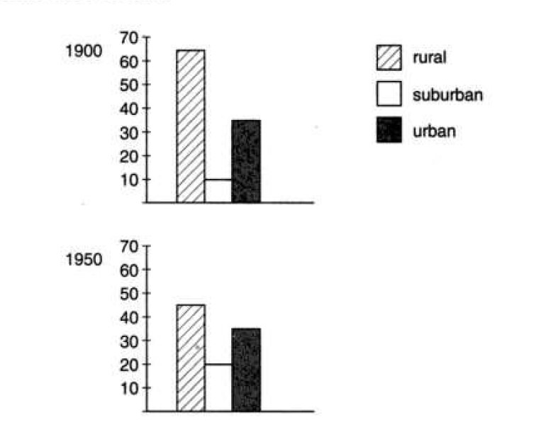
The bar graph shows the percentages of rural, suburban and urban populations in the Northwest region in four different years including the projection of population distribution in 2050.
Overall, the percentage of the village-living population rapidly decreased over the time and a great percentage of people will live in city areas in the Northwest region in the future.
According to the given column graph, more than six out of ten persons in the Northwest region in 1900 lived in rural areas while one out of ten lived in suburban areas. The percentage of the urban area’s population was around 35 in this same year. After 5 decades, the population circulation in this region greatly changed and more than half of the population started living in urban and suburban areas whereas people residing in the countryside reduced to around 45% . In the year 2000, two out of ten people in this region lived in rural areas while the remaining eight were in urban and rural areas (4 each) . According to the projection in 2050, more than half of the North-western population will live in suburban areas while only 10% will remain in the village area. The remaining 35% of its population would settle in urban areas.