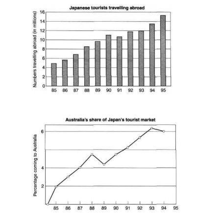
The charts below show the number of Japanese tourists travelling abroad between 1985 and 1995 and Australia‘s share of the Japanese tourist market.
Write a report for a university lecturer describing the information shown below.
The given bar graph provides information regarding the figure of Japanese flocks visiting holiday destinations overseas during the period of 10 years from 1985 to 1995, while the line graph delineates the quantity of tourists from Japan who opted to visit Australia during the same period.
Overall, the bar chart reveals a significant addition in the number of tourists hailing from Japan.
At the fleeting glance, in the initial year, the number of Japanese tourists was recorded at around 5 million. However, over the next five years, the ratio soared by two times to approximately 11 million. However, the proportion of Japanese travellers experienced a slight decline of a few hundred thousand in 1991, subsequently, the numbers kept on rising, and finished at just over 15 million in the end of the given time bracket.
Probing further, an identical surge can be noticed in the amount of the Japanese venturing to Australia. In 1985, merely 2 per cent Japanese visited Australia, but this digit escalated sharply to roughly 5 per cent over the next three years. Australia’s portion of tourists from the land of the rising sun curtailed to just over 4 per cent in 1989, but then bounced back and grew to about 6 per cent by 1993. Although there was another fall in the last given year, the percentage of Japanese touristing Australia still became threefold than it was in the beginning.
Vocabulary:
flocks: a group of large number of people
delineates: describe about something
hailing: belongs to
fleeting glance: a brief look
soared: increased quickly
surge: sudden increase
venturing: going somewhere
escalate: rise
curtailed: limited to
threefold: three times

