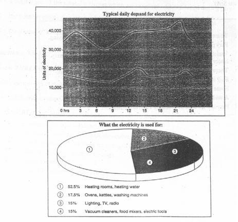
The graph below shows the demand for electricity in England during typical days in winter and summer. The pie chart shows how electricity is used in an average English home.
Summarise the information by selecting and reporting the main features, and make comparisons where relevant.
The line graph compares the daily consumption of electricity in the U.K. in winters and summers. The pie chart illustrates how electricity is consumed in a typical English household.
Overall, the largest demand for electricity is during the coldest months of the year, and this consumption is two times as compared to that of summer. Furthermore, the largest proportion of power consumed by English families is used to heat rooms and water.
It can be vividly seen that the per day utilisation of electricity during winter season fluctuates between 30000 units in morning hours to 45000 units in the late evening. On the other hand, the demand in summer is much lower and less varying, with figures between 13000 units in the morning and 20000 units in the early afternoon. Moreover, in both winter and summer, electricity consumption is at its lowest between 6am to 9 am as well as before midnight.
Probing further into the circular chart, more than half (52.5%) of electricity is used up for warming the rooms and water. The remaining 47.5% of power is almost equally distributed in three portions. Roughly 18% of it is utilised for operating ovens, kettles and washing machines, while 15% is consumed for lighting, televisions and radios. The other 15% is exhausted by vacuum cleaners, food mixers and electric tools.

