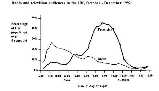
The graph below shows radio and television audiences throughout the day I 1992. Write a report for a university lecturer describing the information shown below.
This provided line graph shows the percentage of audiences in the UK who got entertained by TV and radio through the day from October to December in 1992. Units are given in percentage.
A glance at the graph reveals that the number of people who watched TV was higher than those who listened to the radio during this time. The percentage of individuals who listened to the radio was the highest in the morning, where nearly 30% of people preferred to listen to the radio. After 9.00 am, the percentage of folks listening to radio decreased steadily with exception from 4-6 pm which was about 15%. On the other hand, the percentage of people who preferred to watch TV was the lowest in the morning, but it went up significantly and exceeded the preference of radio after 2.00 pm and reached the peak at 8.00 pm, at nearly 50%. At 10.00 pm, however it began to decrease sharply at midnight.
Overall, most people in the UK were more keen to watch Television than listening to the radio.

