The diagram below the growth in population in Australia in 2001.
Summarise the information by selecting and reporting the main features, and make comparisons where relevant.
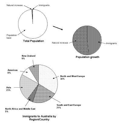
The given circular charts provide information about the increase in the number of people who live in Australia. From the diagram it is obvious that in 2001, one of the most significant influences on the increase of the population was immigration.
If we look at the given information about the total population of Australia, it is noticeable that the effect of natural increase and immigration was approximately the same on the population growth. Obviously, the natural increase had a little bit higher impact than that of the immigrants.
Probing further, the nations which drastically influenced the growth of population in Australia were North and West Europe with a net rate of 34%. Moreover, Asia, Southern and Eastern Europe had also high percentages of the people who immigrated to Australia with 23% and 21% respectively. Immigrants from America and New Zealand were quite lower than the other regions mentioned above, with approximately 8% and 9% orderly. However, regions with the lowest rate of migration were North Africa and the Middle East at 5%.
Overall, the immigrant population swelled significantly in 2001 in Australia.

