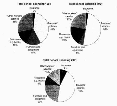
The three pie charts below show the changes in annual spending by a particular UK school in,1991 and 2001.
Summaries the information by selecting and reporting and reporting the main features, and make comparisons where relevant.
The given circular charts show how much a UK school spent on different running costs in three separate years: 1981,1991 and 2001. Data is calibrated in percentage.
In all three years, the greatest expenditure was on staff salaries. However, while other workers’ salaries saw a fall from 28% in 1981 to only 15% of spending in 2001, teachers’ pay remained the biggest cost, reaching 50 % of total spending in 1991 and ending at 45% in 2001.
Expenditure on resources such as books had increased to 20% by 1991 before decreasing to only 9% by the end of the period. In contrast, the cost of furniture and equipment saw an opposite trend. This cost decreased to only 5% of total expenditure in 1991 but rose dramatically in 2001 when it represented 23% of the school budget. Similarly, the cost of insurance saw a rising trend, growing from only 2% to 8% by 2001.
Overall, teachers’ salaries constituted the largest cost to school, and while spending increased dramatically for equipment and insurance, there were corresponding drops in expenditure on things such as books and on other workers’ salaries.

