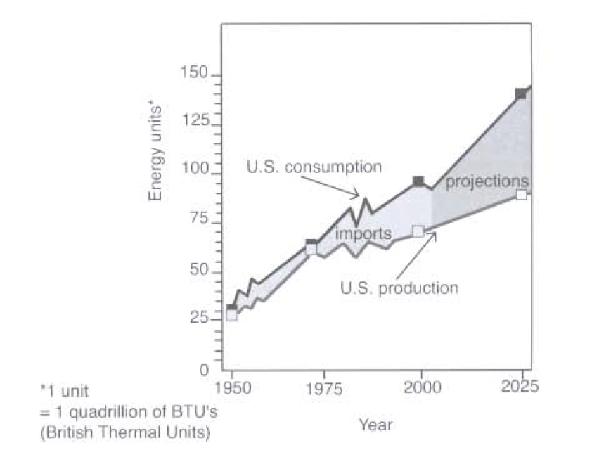
The graph below compares figures for the production and consumption of energy in the US from 1950 to 2000. It also predicts figures for 2025.
Summarise the information by selecting and reporting the main features, and make comparisons where relevant.
The graph depicts the change in the gap between the amount of energy production and consumption in the US from 1950 to 2000. It also provides the estimation for the trend up to 2025.
Commencing at the same point, nearly 25 units, in 1950, both production and consumption increased continuously to just over 65 units in the first 25 years. Although consumption was always higher than production during this period, the difference was negligible. However, the gap between the two figures was extended during the next 25 years, so the US needed to import energy to bridge this gap. To be more precise, while production went up gradually to reach 75 units in 2000, growth in consumption was more rapid, reaching 95 units in 2000. Strikingly, only in the mid-period did both consumption and production witnessed fluctuations in their figures strongly.
As far as the predictions are concerned, this trend is likely to continue up to 2025 with the gap between production and consumption widening. By 2025, it is expected that consumption will reach 140 units, whereas the US will be able to produce only 90 units. So, more energy has to be imported to give to consumers.
Overall, the US production is not keeping up with US consumption so the need for imports will continue in the future.

