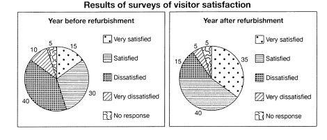
The table below shows the numbers of visitors to Ashdown museum during the year before and the year before and the year after it was refurbished. The charts show the result of surveys asking visitors how satisfied they were with their visit, during the same two periods.
Simmarise the information by selecting and reporting the main features, and make comparisons where relevant.
The circular charts give information about the proportion of visitors to Ashdown museum an year prior and an year post restoration. The charts show the outcomes of a survey regarding visitors’ contention.
Overall, the number of people who visited after renovation was higher than those who visited before it, which shows that refurbishment brought a positive result to the museum.
A glance at the pie charts reveal that before the museum’s upgradation,40% visitants were dissatisfied with the museum and 10 % were very much displeased. Whereas, the result of the survey after refurbishment showed great variations. Ratio of the dissatisfied people reduced by 25% and also the percentage of dissatisfied ones became half post restoration. However, the number of people who chose to give no response remained the same in both cases.
Probing further, only 15 % people were extremely content before refurbishment of the museum but their proportion became more than double after the museum’s enhancement. Moreover, a surge of 10% was witnessed in the ratio of happy and satisfied visitors after renovation which was 30 % prior to the museum’s revival.

