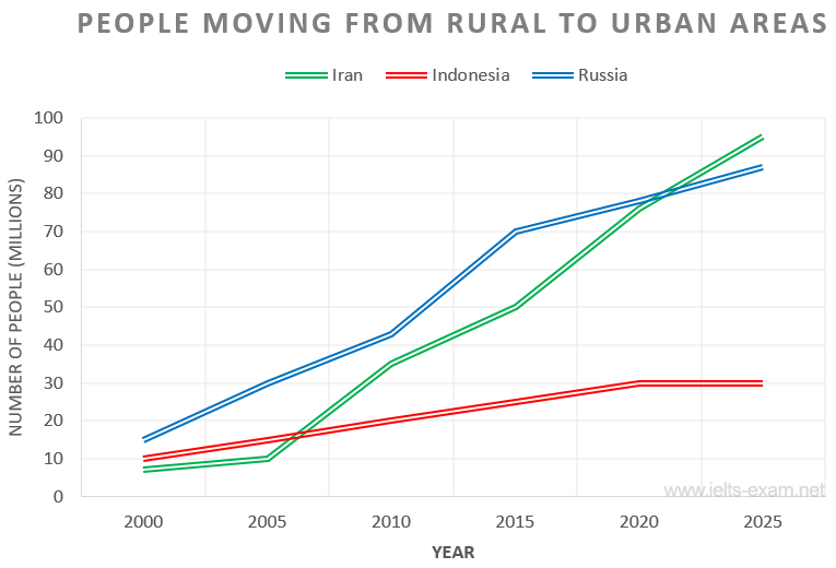
The chart below shows the movement of people from rural to urban areas in three countries and predictions for future years.
Summarise the information by selecting and reporting the main features, and make comparisons where relevant.
The given line graph shows the figures in millions for the migration of people from the countryside to cities in three different countries over the 25-year period from the year 2000 to 2025, including future predictions.
Overall, it is clear that the shift from rural communities towards urban metropolitan areas went upward and will continue to soar in the future except for Iran which is foreseen to remain at plateau.
A glance at the graph reveals that all three countries began the period with similar numbers of migrants. Russia started with the most migrants (around 15 millions) and over the period saw significant increases, particularly between 2010 and 2015 (around 42 to 70 millions) with this upward trend predicted to continue (reaching above 85 millions by 2025). Identically, Iran after a slow start between 2000 and 2005 witnessed a dramatic rise in urban migration, and after 2015 saw an even more dramatic increase, and is expected to surpass Russia’s figures in 2020 reaching at around 95 millions by 2025. However, Indonesia bucks the trend somewhat. Whilst consistently steady between 2000 and 2020, its growth is far less striking than the other two countries (10 to 30 millions). Furthermore, post 2020, it is predicted to level off at 30 millions.

