The charts below show the percentage of water used for different purposes in six areas of the world.
Summarize the information by selecting and reporting the main features, and make comparisons where relevant.
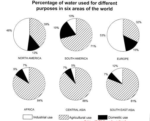
The charts below show the percentage of water
The given set of pie charts depict the statistics for the consumption of water in some major parts around the globe. Overall, it can be seen that agriculture Sector consumed maximum, while the rest of them had variable water consumption. The values are depicted in percentages.
As observed, out of the six regions mentioned, two-thirds of these used the given resource higher than seventy per cent for agricultural purposes, with the exception of North America and Europe. Their consumption was one-third on the contrary. Interestingly, it can be seen that the North American and European regions had almost half of the total water utilization devoted to the Industrial Sector. This was opposite to the rest of the continents and regions, especially in the African and Central Asian regions, where Industrial setups show the values slightly less than one-third of a quarter. Additionally, the Southern East Asian and American nations show similar results with a little bit more use as compared to their former counterparts.
Lastly, it can be seen that the variations for the domestic use do exist, however, the values are no more than one-fifth of the total. While Asian regions have equal usage at 7%, the African continent is just two per cent more as compared to the previous ones. The North and South Americas differ by only six per cent whereas Europe was 10% less than a quarter.