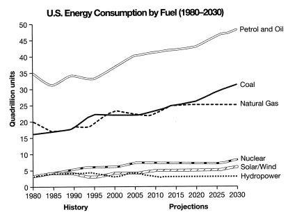
The graph below gives information from a 2008 report about consumption of energy in the USA since 1980 with projections until 2030.
Summaries the information by selecting and reporting the main features, and make comparisons where relevant.
The given line graph compares the amounts of energy consumed from different sources in the USA from 1980 to 2020 and also the predictions till 2030 based on a 2008 report.
At a fleeting glance, it is noticeable that about 35 quadrillion units were consumed from petrol and oil in 1980, which was more than seven times the energy consumption from nuclear, solar/wind and hydropower in the same year. After declining slightly in mid 80s and 90s, it significantly increased to roughly 40 quadrillion units by 2020 and is expected to rise at around 50 quadrillion units by 2030. Furthermore, energy consumption from coal was around 16 quadrillion units in the initial years just under natural gas which provided 20 quadrillion of vigour in 1980. However, energy derived from coal went up considerably until it overtook that of natural gas in 2015 and it will continue its upward trend till it reaches 30 quadrillion units in 2030. Moreover, energy consumed from natural gas was projected to be around 25 quadrillion units until 2015 and it is expected to remain at plateau till 2030.
Probing further, the units of energy consumed from nuclear, solar/wind and hydropower were almost the same as less than 5 quadrillion units in 1980. This amount grew slightly for both nuclear and solar/wind power and it will continue this minimal growth till becoming about 5 quadrillion units. Notwithstanding, hydropower will maintain the same level till 2030.
To conclude it can be clearly seen that fossil fuel, particularly petrol and oil was and will continue to be the most popular source of energy in the USA.

