The bar chart below shows the percentage of Australia men and women in different age groups who did a regular physical activity in 2010.
Summarise the information by selecting and reporting the main features, and make comparisons where
relevant.
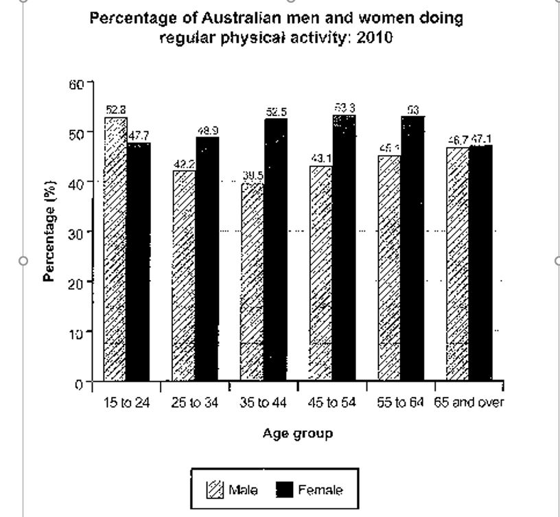
The given bar graph represents the figures for males and females in the Australian Region who indulged in physical activities during the year 2010. It can be clearly observed that in most of the age groups the women were more proactive as compared to their male counterparts. The overall figures also show that nearly half of the total population indulged in these activities.
Beginning with the youngest age group, young male teens, as well as adults, seem to be a little more enthusiastic than the opposite gender, with a difference of about five percent. The adult group had lower statistics as compared to the previous group, and 48.9 per cent females were interested, which was six percent more with respect to males. The trend is same, for the middle age group too, but with a higher variation which was approximately double than former younger group.
Moving on to the elder section, the statistics showed no extraordinary variation for the upper-middle age group ranging from forty-five to fifty-four. The values remained similar for the upcoming ages also, however, the figures were almost neck to neck for the most elderly amongst all. 46.7 percent men, while half a percent more women were actively involved in daily physical routine.