The chart below shows the percentage of households in owned and rented accommodation in England and Wales between 1918 and 2011.
Summarise the information by selecting and reporting the main features, and make comparisons where relevant.
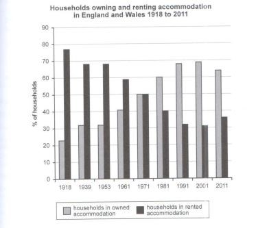
The given bar graph represents the statistics about the rental and own places of residence in England and Wales regions within a gap of 93 years. It is clearly seen that the trend of rented places declined gradually, while the ownerships increased in the same manner during this time period.
Beginning from 1918, the percentage of homes on paid accommodation was stupendously high, more than three times than its owned counterparts. This value then increased by 10% for ownerships while decreased by the same amount for rented ones, and then further, it remained constant for nearly a decade and a half. The trend continues and by 1971, both the categories have equal ownership in the market.
The statistical data, however, begins reversing in the next decades that follow. The values in 1981 are almost identical to the year 1961, except the fact that the categories are reversed. Ironically, by the next 20 years, rented accommodations reduce to almost half of the owned households. Finally, by 2011, with just a slight change in the values, the residents of England and Wales owned almost 30% more households as compared to the rented ones.